Resident Migration and Draw Patterns
The NIC MAP Vision Resident Origin tool, part of the platform’s primary market demand data tool — Market Insight, helps users understand where senior housing residents live and where they came from.
More specifically, this data provides last-known address information of 16,000+ senior housing facilities nationwide and shows draw radiuses for all these communities and their broader markets.
To learn more about Resident Origin and how to access the tool, schedule a meeting with a product expert.
Heat Map
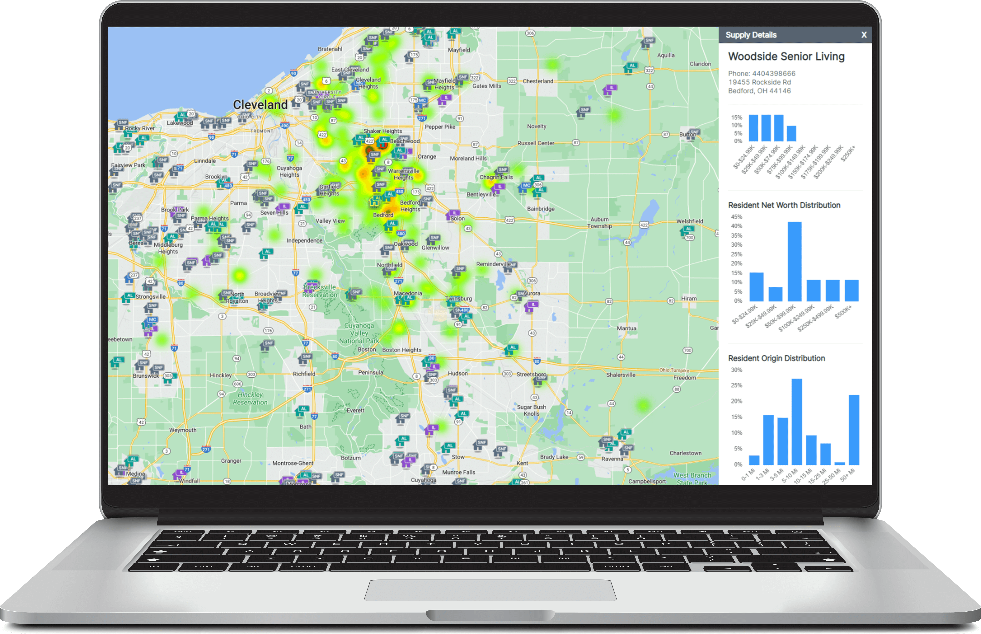
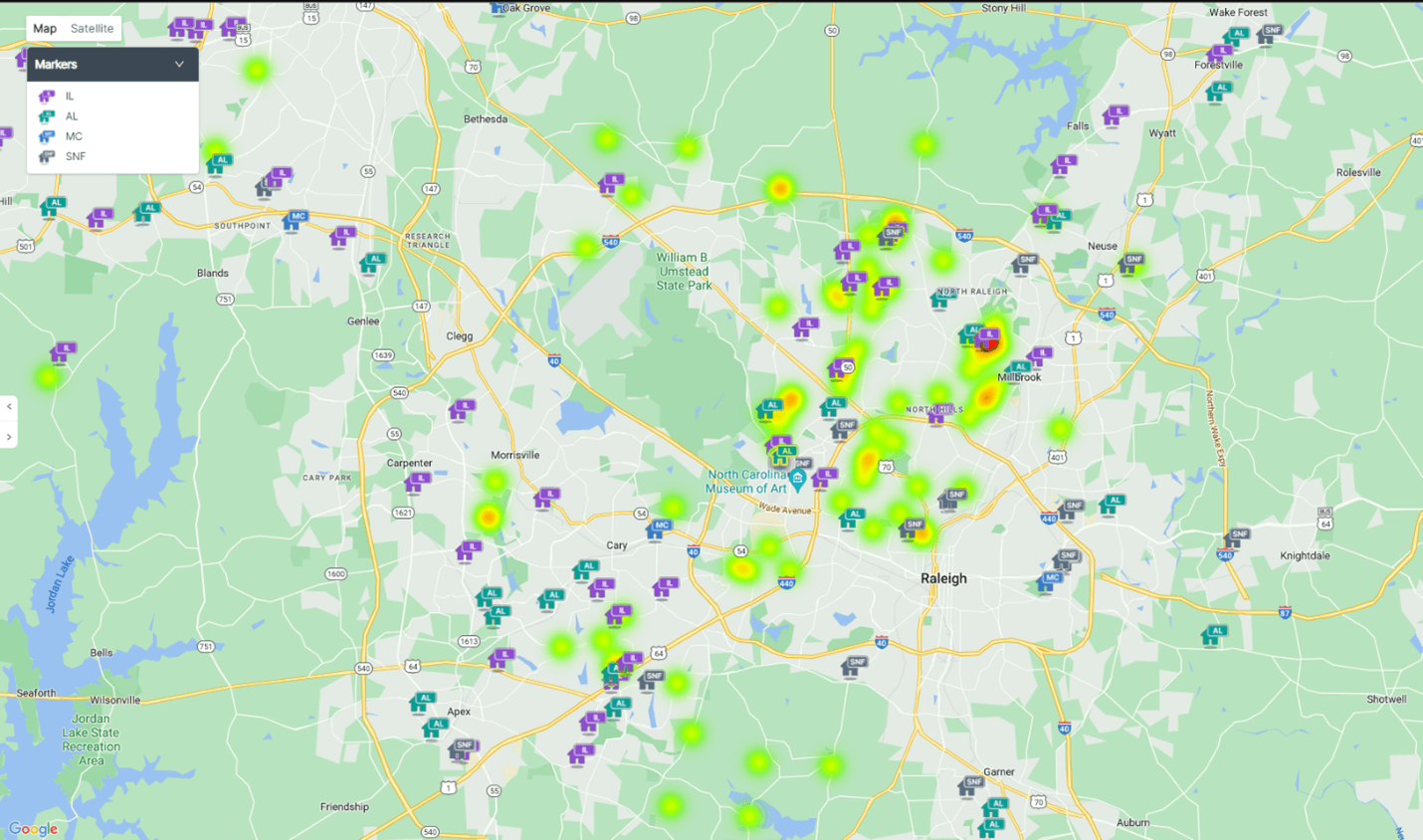
Resident Origin’s heat map shows, through splotches on the map, the areas where residents lived before moving into a selected building. Yellow and red splotches show a higher concentration of residents that derived from an area, while green indicates a smaller concentration.
Supply Tab
The supply tab shows, on an individual community basis, the distribution in miles of how far residents have traveled or relocated to live in that specific community. This way you can easily understand the origin patterns of the communities in a portfolio or even the those of competitors’ communities.
NIC MAP Vision gives operators, lenders, investors, developers, and owners unparalleled market data for the seniors housing and care sector.

